 Design
 App Development
 Web Engineering
 AI Services
 Cloud
Cloud Staffing
 Startups
 Health / Fitness
 Education
 Social
 Nonprofit
 Fintech
 Construction
 Logistics
 Government
 Travel/Hospitality
 HR Software
 About Simpalm
 Our News
 Client Testimonials
 Careers
 Our Blog
 Awards
 Resources
 Information
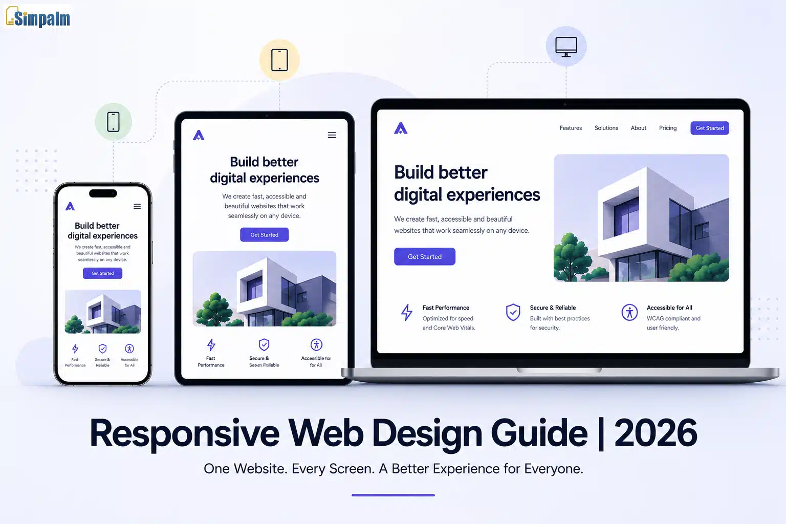
Key Takeaways:
- Responsive design works best when mobile is treated as the primary experience, not an afterthought. Starting with smaller screens helps prevent broken layouts and usability issues later.
- Set breakpoints where your content starts to break instead of copying device sizes. Content-driven layouts stay more reliable as screens and devices continue to change.
- A responsive website is more than flexible layouts. Images, typography, navigation, touch targets, and performance must adapt together to create a usable experience across devices.
- Testing should happen throughout the process, not just before launch. Real devices, different browsers, and mobile performance checks help catch issues that design previews often miss.
_________________________________________________________________________________________
Consider this scenario: A developer builds a beautiful website. It looks clean with all the enhancements, such as a clean layout, sharp typography, and fast load times. Then someone opens it on an Android phone and sees:
- The navigation is overflowing, the hero image is cropped, or the call-to-action button is too small to tap without zooming in.
This is not a minor inconvenience. It is a responsiveness problem that translates to a UX problem and eventually becomes a conversion problem for businesses.
Optimizing for different screen sizes is quite important, given that over 60% of global web traffic now comes from mobile devices. And yet, many websites still treat mobile as an afterthought, something to patch after the desktop version is done. That approach creates exactly the kind of broken experience described above.
A responsive design approach solves this. Not by building separate sites for separate devices, but by building one site that adapts intelligently to any screen it appears on. This guide covers everything you need to do that well, from core principles and a step-by-step design approach to best practices with code, real-world examples, and the tools that make testing faster.
What Is Responsive Web Design?
Responsive web design (RWD) is a design approach where a single codebase serves all devices. The layout, typography, and media adjust fluidly based on the viewport using three foundational techniques:
- fluid grids,
- flexible media,
- CSS media queries.
Thus, you have one URL, one codebase, and one set of content, but presented differently depending on the screen size. But you should keep in mind that this is not the same as adaptive design or mobile-only design. Each is distinctive and behaves differently.
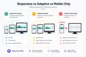
| Responsive uses fluid layouts that scale continuously. One codebase handles all screen sizes.
(Winner!) |
Adaptive uses fixed breakpoints and serves different pre-built layouts per device class. It works, however, it multiplies design and maintenance effort. | Mobile-only creates a separate experience on a subdomain (typically m.yoursite.com). This creates SEO complications, duplicate content problems, and maintenance overhead that grows over time. |
Among the three approaches, Responsive wins for three practical reasons.
- First, it scales to screen sizes that do not exist yet. For example, foldable phones, large tablets, and new device categories. All without requiring you to rebuild anything.
- Second, it is a single codebase to maintain.
- Third, it uses one canonical URL, which Google prefers and which simplifies your entire SEO strategy.
Quick Insight: How did the term “Responsive” come into the mainstream?
The term itself was coined by Ethan Marcotte in his 2010 A List Apart article, which introduced the idea of designing for a flexible grid rather than fixed-pixel layouts. The vocabulary has evolved considerably since then. The principles have not.
The Core Pillars of Responsive Web Design
Before you can apply best practices, you need to understand what makes a layout responsive at a technical level. There are five pillars, three foundational and two that have become standard practice in developing responsive web design as per evolving trends in 2026.
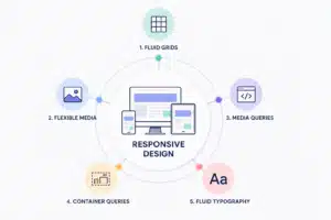
1. Fluid Grids
A fluid grid uses relative units for layout widths instead of fixed pixels. Columns sized in percentages or fr units (fractional units) scale with the available space. CSS Grid and Flexbox have made fluid grid construction far simpler than it was in the early years of responsive design.
Refer to the example code below on how fluid grids are utilized:
.grid {
display: grid;
grid-template-columns: repeat(auto-fit, minmax(280px, 1fr));
gap: 1.5rem;
}
This single rule creates a grid that stacks to one column on small phones, expands to two on tablets, and fills the available layout on desktops. Also, it does not need any additional media queries needed for the column behavior itself.
2. Flexible Media
Responsive layouts are not limited to grids and spacing. Media elements such as images and videos must adapt to changing screen sizes without breaking the layout or slowing down performance. Since visual assets often account for a significant portion of page weight, handling them efficiently is essential for maintaining responsiveness and improving loading speeds across devices.
The baseline rule is:
img, video {
max-width: 100%;
height: auto;
}
But for images that appear in a layout, you need to go further. Using srcset and sizes attributes lets the browser load an appropriately sized image for each viewport. It also reduces mobile page weight significantly and improves Core Web Vitals scores.
Additionally, always include explicit width and height attributes on images. This allows the browser to reserve space before the image loads, which prevents Cumulative Layout Shift.
3. CSS Media Queries
Media queries apply different styles at different viewport widths. They are the mechanism by which a responsive layout knows to change.
The modern standard is to write mobile-first CSS using min-width queries rather than max-width. Start with the smallest layout and progressively add complexity as the viewport grows. This approach aligns with how browsers render pages and with Google’s mobile-first indexing.
Here’s an example how you can use min-width and max-width queries:
/* Base: mobile layout */
.nav {
display: flex;
flex-direction: column;
}
/* Tablet and up */
@media (min-width: 768px) {
.nav {
flex-direction: row;
}
}
4. Container Queries
This is the addition that changes component-level thinking. Standard media queries respond to the browser’s viewport width, but container queries respond to the width of the parent element.
Why does this matter? A card component placed inside a narrow sidebar needs different styling than the same card placed in a full-width hero section. Both see the same viewport width. Only container queries can tell the difference.
Refer to the following component to understand how container queries are placed:
.card-wrapper {
container-type: inline-size;
}
@container (min-width: 400px) {
.card {
display: grid;
grid-template-columns: 200px 1fr;
}
}
Container queries are fully supported in all modern browsers and are now considered standard practice. If you are still designing at the page level only, you are missing the abstraction that makes truly reusable components possible.
5. Fluid Typography with clamp()
Hard breakpoints for font sizes create jarring visual jumps. A heading that reads well at 32px on mobile and 56px on desktop should not just flip between those two values at one arbitrary pixel width.
The clamp() function solves this elegantly:
h1 {
font-size: clamp(1.75rem, 4vw + 0.5rem, 3rem);
}
This sets a floor (1.75rem), a viewport-relative preferred value, and a ceiling (3rem). The heading scales smoothly between them without a single additional media query.
Key Terms To Understand
- Floor (1.75rem): The minimum size the heading can shrink to, even on very small screens.
- Viewport-relative preferred value: A flexible size that adjusts automatically based on the screen width.
- Ceiling (3rem): The maximum size the heading can grow to on larger screens.
- Media query: A CSS rule used to apply different styles for specific screen sizes or devices.
How to Design a Responsive Website: A Step-by-Step Approach
Many websites become difficult to navigate on smaller screens because responsiveness is treated as an afterthought during development. A reliable responsive design process starts with planning, content structuring, and imagining component behavior. Here is a practical step-by-step approach to building layouts that adapt effectively:
Step 1: Define Your Viewport Targets
Keep one rule fundamentally clear: Do not design for specific devices. Device sizes change frequently with the launch of new mobile phones, tablets, and desktops. Instead, design for content breakpoints.
Practical starting points that cover the majority of real-world usage:
- 360px (small phones),
- 768px (tablets),
- 1024px (laptops),
- 1440px (desktop monitors).
Note: These are a starting framework, not a rigid specification.
Step 2: Audit and Prioritise Your Content
List every content element on every page. Then rank each element by its priority for a mobile user, as you cannot display all elements as they are on smaller screen sizes.
Furthermore, content hierarchy drives layout decisions, and then “aesthetics” follow. If you skip this step, you end up with desktop layouts being forced on smaller screen sizes.
Step 3: Design Mobile-First Wireframes
Create wireframes for mobile first, once the wireframes are accepted and approved by stakeholders on mobile then create the wireframes for tablet and desktop.
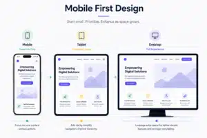
This helps you to stay nimble for mobile and then add design elements for desktop easily. For mobile, start with a single column, no sidebar, and essential navigation only. This forces clarity. Every element that survives the mobile wireframe has earned its place.
The key question at this stage is not “what do we remove on mobile?” but “what does the desktop version add?” Progressive enhancement asks you to start with the core experience and layer in complexity. On the other hand, graceful degradation asks you to start with a complex layout and strip things away. The first approach produces better results.
Step 4: Define Component Behavior
Designing page-level wireframes is not enough. Every repeating component needs its own responsive logic defined:
How does a card stack on mobile?
How does a data table collapse?
How does a modal behave on a small screen?
Container queries make this component-level thinking the right default. Define behavior at the component level, and your layouts become genuinely composable.
Step 5: Build with Scalable Units
Use rem for typography, percentages or fr units for layout widths, and em for spacing tied to type size. Avoid pixels for any layout-critical dimension.
This is not a style preference but a good responsive practice because pixel-based layouts are brittle. A user who has set their browser’s default font size to 18px will break a layout built in pixels in ways that rem-based layouts handle automatically.
Step 6: Test at Every Stage
Start with Chrome or Firefox DevTools in Device Mode. Check column collapse, image scaling, text overflow, and navigation toggling at every breakpoint. You shall also refer to emulators and tools like BrowserStack before launch. Furthermore, always test on real devices extensively before shipping.
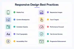
10 Responsive Web Design Best Practices
Responsive design principles are easy to understand in theory, but often fail during implementation. The following best practices focus on web design best practices that improve usability, maintainability, performance, and cross-device consistency in real-world responsive websites.
1. Write Mobile-First CSS
Use min-width media queries, not max-width. Write your base styles for mobile and layer complexity upward. This is not just good for maintainability, but it also aligns directly with Google’s mobile-first indexing. If your CSS is desktop-first, you are adding mobile styles as overrides, which is harder to maintain and more prone to specificity conflicts.
2. Set Breakpoints Where Your Content Breaks
Avoid setting breakpoints around specific devices, such as “768px because that matches an iPad.” Instead, resize your layout gradually in the browser and identify the points where spacing, alignment, readability, or component structure begin to break down. Those are your actual breakpoints. Device dimensions evolve constantly, but content-driven breakpoints remain stable because they are based on the needs of the layout itself.
3. Use Container Queries for Component-Level Control
When a component appears in different contexts, such as a sidebar, hero section, or content grid, relying only on viewport media queries often creates inconsistent behavior. A card that works well in a wide layout may break inside a narrower container or even sometimes on the same screen size. Container queries solve this by adapting components based on the space they actually occupy. Use them as the default for component-level responsiveness, while reserving viewport media queries for broader page structure changes.
4. Eliminate Breakpoint Jumps with Fluid Typography
Apply clamp() to all heading levels and your body text. Set an approximate minimum for mobile and large screens, and a viewport-relative scaling value in between. This removes an entire category of layout issues that come from font sizes changing abruptly at breakpoints.
5. Serve Correctly Sized Images with srcset
A 2400px-wide hero image loaded on a 390px screen is wasted bandwidth and a slower LCP. Use SRCSET to provide multiple image sizes and let the browser pick the right one. Then pair it with modern formats, such as WebP or AVIF, for meaningfully smaller file sizes without perceptible quality loss.
<img
src=”hero-800.webp”
srcset=”hero-400.webp 400w, hero-800.webp 800w, hero-1600.webp 1600w”
sizes=”(max-width: 600px) 100vw, (max-width: 1200px) 80vw, 1200px”
alt=”Product dashboard”
width=”1600″
height=”900″
loading=”lazy”
/>
6. Respect Touch Target Minimums
Apple’s Human Interface Guidelines recommend a minimum tap target of 44 by 44 pixels. While Google Material Design recommends 48 by 48 pixels. Small buttons and links are one of the most common usability failures on mobile.
In such cases, use padding to extend the tappable area without changing the visual size of the element. For example, a link with 12px of padding on all sides can look like compact text but behave like a proper touch target.
Hamburger menus on mobile are widely understood and acceptable. But they must work without a mouse. That means keeping keyboard navigation support and proper ARIA labeling for screen readers. On the other hand, hover-only navigation menus are entirely unusable on touch screens.
As per market trends, bottom navigation is increasingly common for mobile-heavy products because it puts key actions within thumb reach.
8. Treat Performance as Part of Responsiveness
A layout that looks correct on mobile but loads slowly is not a good responsive experience.
- Set fetchpriority=”high” on your hero image to improve LCP.
- Use loading=”lazy” on below-the-fold images to reduce initial page weight.
- Add aspect-ratio to image and video containers to prevent layout shift before media loads.
Core Web Vitals (LCP, CLS, INP) are responsive design problems as much as they are performance problems. Responsive design decisions directly affect all three scores.
9. Build with Progressive Enhancement
Start with semantic HTML that renders correctly without CSS or JavaScript. Add styling as an enhancement layer. Afterwards, add interactivity as another layer. This approach ensures that your core content is accessible on any device, in any browser, under any network condition.
10. Design for All Input Types
Input methods are no longer tied to screen size. Tablets may use keyboards and mouse, desktops can have touch-enabled displays, and many laptops switch between traditional and tablet modes. Because of this, hover interactions should be treated as enhancements, not requirements. Always provide an alternative interaction path for touch and keyboard users, and use the pointer media query to detect coarse input where needed:
@media (pointer: coarse) {
.dropdown:hover .menu {
display: none; /* Touch devices: use click instead */
}
}
6 Real-World Responsive Website Examples
Responsive design principles become easier to understand when viewed in production environments. High-performing websites rarely rely on simple resizing alone. They rethink navigation, content hierarchy, component behavior, and performance based on device context. The examples below show how established digital products adapt responsively while maintaining usability and consistency across screen sizes.
Airbnb
Airbnb’s search interface showcases a well-structured approach to content hierarchy across different screen sizes.
On mobile, the search bar dominates the top of the screen, and the map is deprioritised entirely until the user explicitly requests it. Listings stack in a single column with large touch targets on every interactive element.
While on the desktop, the map and listings appear side by side.
Key Learning: No content is missing on either viewport. What changes is how the content is arranged based on what a user in each context needs first.
Spotify Web Player
Spotify’s web player uses a persistent sidebar navigation on desktop and collapses to a bottom navigation bar on mobile. Thus, they ensure placing playback controls and key navigation items exactly where a thumb can reach them naturally.
Key Learning: The transition is not just visual resizing. It is a fundamental rethink of information architecture based on the input method and screen real estate available. This is the kind of component-level thinking that container queries are built to support.
Stripe
Stripe’s marketing pages demonstrate how to handle complex, visually rich layouts responsively.
On mobile, gradient animations and three-dimensional UI elements are simplified or replaced with static alternatives while maintaining the design language without destroying performance. Alongside, image assets are served at appropriate sizes.
Key Learning: Responsive design is not about shrinking complex visuals to fit smaller screens. It is about simplifying interactions and visual intensity while preserving usability, performance, and brand consistency across devices.
Apple.com
Apple.com is often cited as a benchmark for responsive design, and for good reason.
Here’s why,
- The site uses content-driven breakpoints that feel invisible.
- Images scale without cropping or distortion.
- Typography adjusts through every viewport width without a single awkward step.
- Navigation transitions cleanly from a full header to a hamburger menu with a slide-in panel that is accessible by keyboard.
The overall effect is a site that seems purpose-built for whatever device you are using, even though it is a single responsive codebase.
Key Learning: Effective responsive design depends on coordinated changes across typography, navigation, layouts, and media instead of isolated visual adjustments.
Common Responsive Design Mistakes to Avoid
Even well-designed websites can run into responsive issues when small details are overlooked. Poor breakpoint choices, fixed layouts, missing accessibility, or slow-loading assets can affect usability across devices.

Below are some of the most common responsive design mistakes and how to avoid them.
- Designing for specific devices instead of content. Setting breakpoints at “768px for iPad” means your layout breaks the moment a new device category appears. Set breakpoints where your content breaks, not where today’s popular devices happen to sit.
- Using pixels for layout-critical dimensions. A fixed-pixel layout will overflow or collapse unpredictably when browser font sizes change or when screens are smaller than anticipated. Use relative units for everything that matters to the layout.
- Hiding content on mobile instead of restructuring it. Using display: none to remove content on mobile is not a responsive design. It is responsive hiding. If content is important enough to exist, it deserves to be accessible on every device, even if it appears differently.
- Ignoring touch target size. Interactive elements that are too small to tap accurately frustrate mobile users and drive abandonment. This is one of the easiest things to fix and one of the most commonly overlooked.
- Neglecting landscape orientation. Most mobile testing happens in portrait mode. Landscape orientation on phones creates a very short viewport that breaks layouts designed only for portrait. Always test both.
- Treating performance as a separate concern. Responsive design that ships oversized images, layout-shifting containers, and render-blocking fonts is not finished. Performance is built into the design process, not added at the end.
- Forgetting keyboard and screen reader accessibility on navigation. A hamburger menu that only works with a mouse is not an accessible navigation pattern. Every interactive element in your responsive UI must be keyboard-navigable and correctly labeled for assistive technology.
Responsive Website Design Tools for Design, Testing, and Performance
Responsive design is easier to manage when you use the right tools. From wireframing and development to testing and performance checks, each tool helps solve a different part of the process.
The tools below can help teams build responsive websites faster, test layouts across devices, and fix issues before launch.
Design and Prototyping
Figma remains the dominant tool for responsive wireframing and component design. Auto layout and component variants make it straightforward to define how a component behaves across breakpoint states.
Framer offers a code-first prototyping environment that can test real responsive behavior before a single line of production code is written.
Development
Bootstrap 5 provides a mature, well-documented grid system and component library for teams that want a proven foundation. Tailwind CSS has become the default for utility-first responsive development, with built-in breakpoint prefixes (md:, lg:, xl:) that make responsive styling explicit and co-located with the HTML. For custom work, CSS Grid and Flexbox with native container queries need no additional framework.
Testing
Chrome DevTools Device Mode is useful for quick testing across different screen sizes and breakpoints. For testing in real browser environments across iOS and Android devices, BrowserStack is a reliable option. Responsively App lets you view your website at multiple screen widths at the same time, making it easier to spot layout issues across breakpoints in one place.
Performance and Core Web Vitals
Google PageSpeed Insights gives a full breakdown of Core Web Vitals scores and specific improvement recommendations. And WebPageTest provides deeper diagnostic data, including waterfall charts, render filmstrips, and field data from real users.
How to Test Responsive Designs Properly
Testing responsive design is more than checking a few screen sizes before launch. Different browsers, devices, and orientations can expose layout and usability issues that are easy to miss during development. The stages below provide a practical way to test responsive websites before and after launch.
Stage 1: Design Phase (DevTools)
At every breakpoint, check: column collapse, image scaling, text overflow, navigation toggling, and form field usability. Chrome and Firefox DevTools both have accurate device simulation that covers the most common screen sizes.
Stage 2: Pre-Launch (Emulator and BrowserStack)
iOS Safari has historically been the source for finding the most browser-specific responsive quirks, from viewport height bugs to scroll behavior. Make sure you always test there. Test on mid-range Android running Chrome, as this represents the majority of global mobile traffic. Also, keep in mind to check the landscape orientation on both platforms.
Stage 3: Pre-Launch (Real Devices)
Browser simulators are useful, but they cannot fully match real device behavior. Test your website on at least one iOS device and one Android device before launch. Pay close attention to areas that emulators often miss, such as touch accuracy, font display, tap response, and how the on-screen keyboard affects layout and content spacing.
Stage 4: Post-Launch (PageSpeed Insights)
After launch, test your pages using Google PageSpeed Insights. It shows performance data from real users along with lab test results and offers suggestions linked to Core Web Vitals. Since mobile performance often faces more limitations, use the mobile score as your main benchmark while reviewing desktop results separately.
At every breakpoint and on every device, check that the page has no horizontal scrolling, text is easy to read without zooming, buttons and links are easy to tap, images display clearly without stretching or blurring, navigation works properly with keyboard input, and forms remain usable when the on-screen keyboard appears.
Conclusion
Responsive web design is not a checklist you complete once. It is a way of thinking about interfaces, one that starts with the smallest, most constrained context and builds outward.The businesses and teams that build responsive web design share a common approach:
- They treat mobile as the primary experience, not a fallback.
- They define breakpoints based on content, not devices.
- They think about components before pages, build performance into the design process, and validate experiences through real-device testing.
These principles shape an adaptive design approach, especially as websites must adapt to a growing range of screen sizes and interaction patterns.
Applying the right responsive web design best practices and learning from proven examples can help close design and user experience friction points. For businesses planning or designing a responsive website, working with professional web design teams can make implementation more structured and scalable. At Simpalm, responsive experiences are approached as part of the product strategy, usability, performance, and long-term maintainability from the start. We create digital experiences that continue to perform reliably as devices, screen sizes, and user expectations evolve.
Frequently Asked Questions
Q1. What is the difference between responsive and adaptive design?
Ans. Responsive design uses a single fluid codebase that scales continuously across all screen sizes. Adaptive design uses separate fixed-width layouts served at predefined breakpoints. Responsive is generally preferred because it requires less maintenance and handles new screen sizes without redesign.
Q2. What is mobile-first design?
Ans. Mobile-first means writing your base CSS for the smallest viewport and adding complexity as the screen gets larger using min-width media queries. It produces cleaner code than desktop-first approaches and aligns with how Google crawls and indexes your site.
Q3. What breakpoints should I use for responsive design?
Ans. Start with 360px, 768px, 1024px, and 1440px as a framework. But treat these as starting points, not rules. Add breakpoints wherever your specific layout starts to break, regardless of whether it matches a common device width.
Q4. What are container queries, and should I use them?
Ans. Container queries apply styles based on the width of a component’s parent element rather than the viewport. They are fully supported in all modern browsers and are now the right approach for component-level responsive styling. You should be using them.
Q5. How does responsive design affect SEO?
Ans. Google uses mobile-first indexing, meaning it crawls and indexes the mobile version of your site. A responsive, single-URL site is the preferred configuration. Separate mobile sites on m. Subdomains create duplicate content management challenges that responsive design eliminates entirely.
Q6. How do I test if my website is responsive?
Ans. Start with Chrome DevTools Device Mode for a quick check of common breakpoints. Use BrowserStack or Responsively App for cross-browser and cross-device coverage before launch. Test on real physical devices for final validation. Run Google PageSpeed Insights after launch for field data and Core Web Vitals scores.


