
 Design
 App Development
 Web Engineering
 AI Services
 Cloud
Cloud Staffing
 Startups
 Health / Fitness
 Education
 Social
 Nonprofit
 Fintech
 Construction
 Logistics
 Government
 Travel/Hospitality
 HR Software
 About Simpalm
 Our News
 Client Testimonials
 Careers
 Our Blog
 Awards
 Resources
 Information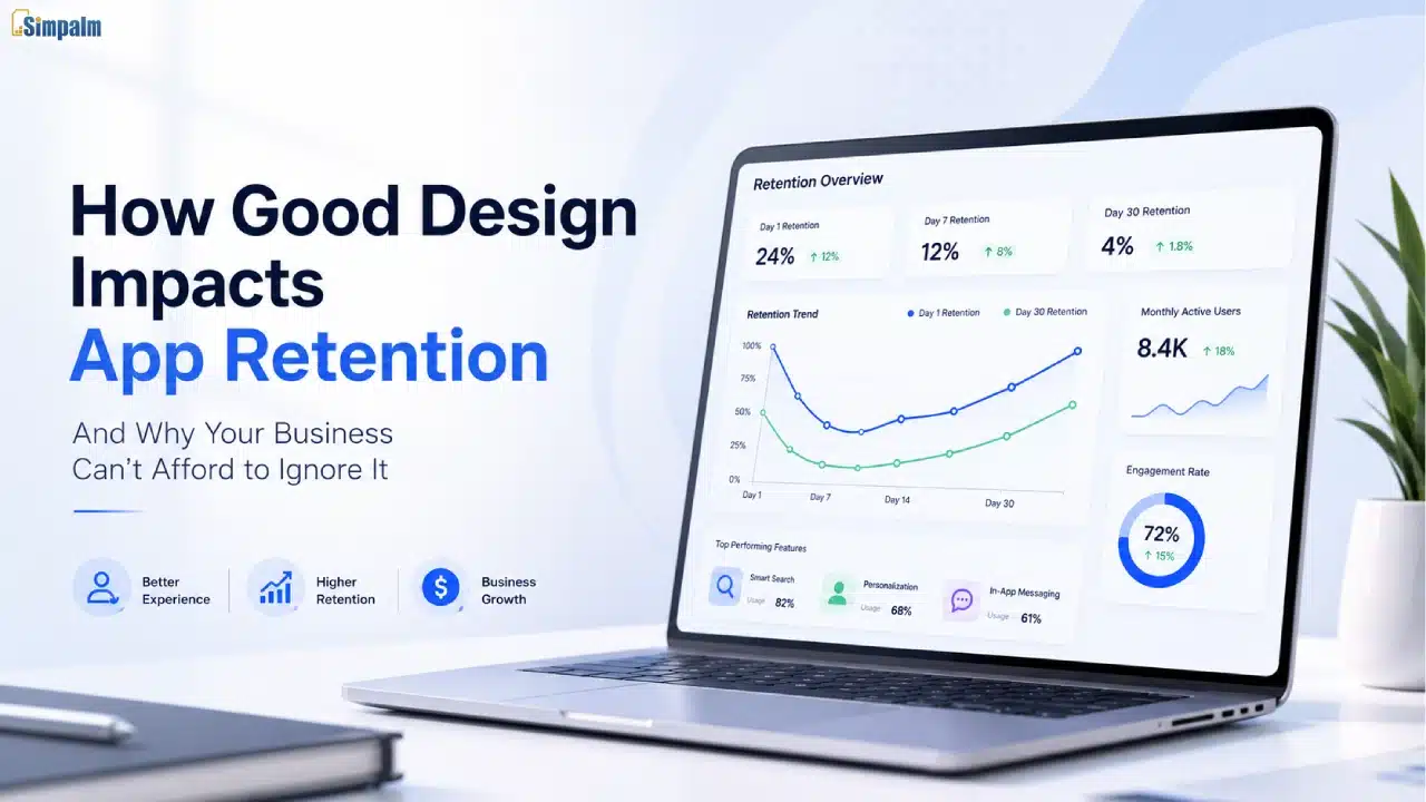
User acquisition is a key challenge for most digital products; however, retention is even a bigger challenge.
As per Business of Apps stats, average app retention is 21-24% on day 1, dropping sharply to 2-4% by day 30 on both Android and iOS. UXCam reports that over 90% of users churn within 30 days across industries. One of the biggest reasons behind this drop is poor user experience. Confusing navigation, slow load times, inconsistent interactions, and friction-heavy user journeys often push users to abandon the app before they experience its real value.
Yet many organizations still view design as a surface-level concern. In truth, design holds a strategic core. It shapes ease of app usability, perceived value, user confidence, engagement patterns, and retention economics.
This article analyzes how design execution influences retention, explores the business costs of poor UX, and explains why design maturity is a competitive advantage for leading product teams.
Key Takeaways
- Poor UX increases app churn. Confusing navigation and slow performance push users away.
- Better onboarding improves retention. Users stay longer when they reach value faster.
- UX improvements deliver measurable ROI. Onboarding redesigns can improve retention by up to 40%.
- Consistent design systems build trust. Personalized experiences increase product stickiness.
- Design drives business growth. Strong UX improves adoption, retention, and customer lifetime value.
The Retention Problem is a Design Problem
Before we get into solutions, let’s align on the problem.
When engagement drops, many companies focus on adding features or optimizing marketing notifications. However, these optimization strategies have their own priority, but the design with friction also plays a significant role. If the core product experience is not user-friendly, technical capabilities alone cannot prevent user loss.
Think about the last time you deleted an app. It probably wasn’t because it lacked a feature. It was because it felt clunky, confusing, or difficult to use. That’s the design problem. And the inverse is equally true. The apps that dominate screen time aren’t always the most feature-rich. They’re the ones that feel effortless.
In the following table, we have highlighted the most common UX-related aspects that lead to app churn:
|
Root Cause of App Churn |
% of Users Who Cite This Reason |
| App too difficult to navigate | 72% |
| Slow load times / poor performance | 53% |
| Confusing onboarding experience | 44% |
| Doesn’t feel personalized | 38% |
| Privacy concerns/lack of trust | 29% |
Source: Compiled from industry retention benchmarks and UX research studies
Addressing these retention risks requires improving the UX touchpoints that have the greatest impact on user activation, perceived value, and long-term engagement. Let’s discuss each touchpoint, such as onboarding experience, navigation, and personalization, in detail.
Optimizing Onboarding Experience for Long-Term Engagement

Onboarding is the most critical stage of the user journey. Users form a definitive judgment about a product’s value within the first 60 seconds. If the initial experience fails to demonstrate utility, the probability of return is significantly diminished.
A common error in B2B product design is the front-loading of information. Attempting to showcase every feature simultaneously leads to cognitive overload. Effective onboarding focuses exclusively on the steps required to achieve a “first win.”
Good onboarding design strips away everything that isn’t essential to getting the user to their first meaningful outcome. By removing unnecessary decisions and steps, you reduce the time-to-value, which is a key predictor of retention.
| Thumb rule: Reduce cognitive load wherever possible.
Every unnecessary click, confusing instruction, or ambiguous label increases the likelihood of user abandonment. |
Streamlined flows allow users to complete tasks quickly, building positive momentum from the first session.
When you get onboarding right, you’re not just improving day-1 retention. You’re setting a behavioral pattern. Users who find value immediately are significantly more likely to explore advanced features and become long-term brand supporters.

Once a user is past onboarding, retention directly depends on easy and consistent UX. Once a user understands the core value, the product must reliably deliver that value in every subsequent session without introducing new friction.
Navigation clarity is where most enterprise and B2B apps quietly disengage users. When someone has to think about where to go next, you’ve already lost the design advantage. A clear, intuitive hierarchy allows users to build a mental map of the application, fostering familiarity and ease of use.
Performance is non-negotiable. Apps that take more than three seconds to load lose a significant portion of their audience before they even see the interface. This isn’t just a technical problem; it’s also a design problem. Heavy, over-engineered UIs with excessive animations and unoptimized assets make products feel slow. Lean, intentional design directly supports high performance and responsiveness.
Visual consistency eliminates micro-friction. When colors, typography, iconography, and interaction patterns are consistent across the product, users build a mental model of how things work.
The following table compares poor versus strong design implementations and their resulting impact on user retention:
| Design Layer | Poor Implementation | Strong Implementation | Retention Impact |
| Onboarding | Feature tour, information overload | Value-first flow, guided to first win | High; Sets behavioral pattern |
| Navigation | Inconsistent labels, deep nesting | Predictable IA, surface-level access | High; reduces abandonment |
| Performance | Heavy UI, slow transitions | Optimized assets, instant feedback | Very High; direct drop-off driver |
| Visual Language | Inconsistent styles, unclear hierarchy | Cohesive design system, clear CTA | Medium; builds trust and familiarity |
| Personalization | Generic, one-size-fits-all | Adaptive, context-aware | Medium-High; increases relevance |
The Role of Design Systems in Building Trust
In B2B environments, trust is established through consistent product reliability. Every interaction a user has with the interface either reinforces or undermines their confidence in the platform.

Products lacking a mature design system often accumulate “UX debt.” This occurs when different modules follow different visual or behavioral rules. Although UX debt is frequently overlooked in technical backlogs, its impact is significant. Users are forced to relearn workflows as they move between modules, creating friction and frustration.
For example, a form submission may behave differently across sections of the product. A confirmation dialog might appear in one workflow but not another. Even primary action buttons changing position between screens can disrupt the user experience.
When interaction patterns become inconsistent, users are forced to stop and reorient themselves. That interruption increases cognitive load and weakens the mental model they depend on to navigate the platform confidently. Over time, these small inconsistencies create a perception of system unreliability.
Common Signs of UX Debt
Common signs of UX debt usually emerge through repeated interface inconsistencies that gradually disrupt the user experience, such as:
- Inconsistent button placement across screens
- Different forms of behavior between modules
- Missing or irregular confirmation dialogs
- Variations in navigation patterns
- UI elements that look or behave differently without a reason
To avoid these issues, modern product teams rely on structured design systems and reusable component libraries. These are commonly built with frameworks such as React, Vue, or Angular. Many teams manage components in Storybook and support consistency with visual regression testing tools like Chromatic or Percy.
This approach helps maintain interface consistency at scale while reducing UI drift during development cycles.
| Business Impact: Mature design systems can reduce design and development effort by up to 34%, while improving task completion speed, feature adoption, and overall product consistency. The result is lower support overhead, faster onboarding, and stronger user retention. |
Implementing Personalization as a Retention Driver
Once users trust a product and become comfortable navigating it, the next challenge is keeping the experience consistently relevant over time. This is where personalization becomes a powerful retention driver.
Personalization means designing experiences that adapt to user behavior over time. This can include remembering preferences, surfacing relevant features based on usage patterns, and reducing repetitive friction across sessions.
The products that become part of a user’s daily workflow usually share one common trait: they adapt to the way people work. Dashboards surface relevant information, recommendations feel useful, and workflows remember user preferences instead of forcing repetitive actions every session.
During a recent discussion on user engagement and workflow design, Simpalm’s Director of Product Design shared an observation that reflects how personalization impacts retention in real-world products:
“We’ve consistently seen that users engage more deeply with products that adapt to their workflow over time. Even small personalization elements — like saved views, smart defaults, or contextual recommendations — reduce friction in a meaningful way. When users feel like the product understands how they work, retention naturally improves because the experience becomes harder to replace.”
— Director of UI/UX, Simpalm
What Effective Personalization Looks Like
In practice, effective personalization is often built through small but intentional design decisions that make everyday workflows faster and more relevant for users, such as:
- Saved workflows and dashboard layouts
- Personalized recommendations and content
- Smart defaults based on user behavior
- Remembered filters, views, and notifications
- Faster access to frequently used actions
For businesses, the impact is clear. When users spend time customizing their workflows, settings, and notifications, they become more connected to the product. Over time, personalized experiences make the product more useful and harder to replace, which improves long-term retention.
How to Audit Your Design for Retention Risk
To assess whether your product experience is supporting long-term retention, review the following usability and product health indicators:
- Is your time-to-first-value (the moment a new user experiences the core benefit) measured, and is it under 5 minutes?
- Do users who complete onboarding return at a meaningfully higher rate than those who don’t?
- Is your navigation consistent with user expectations, or do users frequently misroute and backtrack?
- Are error states helpful and descriptive, or do they lack actionable information?
- Does the interface provide immediate visual feedback for all user actions?
- Are load times optimized across all target user devices and network conditions?
These are not just design quality checks. They are indicators of product health and retention performance. Each one directly influences user confidence, engagement, and long-term adoption, making them critical areas for continuous design improvement.
The ROI Case: Why Design Investment Pays Back in Retention
In many industries, customer acquisition costs are estimated to be 5–7 times higher than retention costs. That is why even modest improvements in retention can create a substantial long-term revenue impact.
Retained users are more likely to expand their usage, adopt additional features, refer others, and contribute valuable customer success stories. They also require less onboarding and support over time because they already understand how to navigate and extract value from the product efficiently.
Moreover, retention gains are often driven by targeted UX improvements that reduce friction and make the product easier to navigate and adopt over time.
For example, improving a weak onboarding experience through UX audits and usability enhancements can significantly improve day-30 retention. Similarly, simplifying navigation and refining interaction patterns can reduce support tickets by preventing confusion before it happens. Personalization features can further strengthen retention by making the product feel more relevant to individual users.
Consider the following table to better understand how specific design improvements influence retention, engagement, and overall product performance:
| Design Investment | Primary Retention Metric Impacted | Typical Improvement Range |
| Onboarding redesign | Day-7 and Day-30 retention | 15–40% improvement |
| Navigation simplification | Session depth, return frequency | 10–25% improvement |
| Performance optimization | Bounce rate, session length | 20–35% improvement |
| Personalization features | 90-day retention, expansion revenue | 10–30% improvement |
| Accessibility improvements | Total addressable user base | 5–15% broader reach |
Ranges based on industry benchmarks from UX case studies and retention research
Companies that treat design as an ongoing strategic investment consistently outperform competitors. Each incremental improvement builds a more efficient, trusted, and indispensable product.
Best Practices for Product Design Maturity
Products with strong retention rates often share a few consistent traits. Their interfaces stay focused and purposeful, with every on-screen element serving a clear function. Core workflows feel intuitive, without unnecessary confirmation steps, repetitive inputs, or avoidable friction.
Users should also be able to navigate the product with confidence. Errors need to be communicated clearly, and the visual language should remain consistent enough that users can predict how new features will behave without requiring additional guidance.
Here are the Common Traits of Mature Product Design
- Clear and distraction-free interfaces
- Consistent interaction patterns across workflows
- Minimal friction in core user journeys
- Helpful and actionable error states
- Continuous usability testing and iteration
- Design systems that maintain consistency at scale
These experiences are rarely accidental. They are usually the result of teams that continuously test usability, refine friction points, maintain structured design systems, and treat user feedback as a meaningful product signal rather than just a support issue.
Over time, this creates products that feel more reliable, intuitive, and easier to navigate.
Product maturity is often reflected in how naturally users can move through the experience without needing additional guidance or support.
For businesses, this typically means involving design much earlier in the product and engineering process. Teams that achieve stronger retention are usually the ones where design thinking influences product decisions from the very beginning — not just during final UI reviews before launch.
The Bottom Line
Design is not just a visual layer. It directly shapes trust, usability, and long-term product retention. Every interaction either strengthens the user experience or adds friction that increases the risk of churn.
When retention declines, the issue is not always a lack of features. In many cases, the real problem is friction within the everyday product experience. If workflows feel confusing, slow, or inconsistent, user engagement gradually declines over time.
That is why improving usability often delivers a greater retention impact than adding new functionality.
This is also an approach we actively follow at Simpalm while working with digital products as a creative app design agency. In one SaaS engagement, our client saw an increase in day-30 retention from under 20% to 41% within two quarters, without releasing a single new feature. The product stayed the same, but the experience of using it improved significantly.
Frequently Asked Questions
Q1. What is the 80/20 rule in UI/UX design?
Ans. The 80/20 rule, also known as the Pareto Principle, suggests that 80% of users typically rely on 20% of a product’s features. In UI/UX design, this means teams should prioritize the most frequently used workflows and make them as intuitive and efficient as possible.
Q2. How to improve app retention?
Ans. App retention improves when users can quickly understand the product, achieve value faster, and navigate the experience without friction. Optimizing onboarding, reducing cognitive load, improving performance, and personalizing workflows are some of the most effective retention strategies.
Q3. Why is design important in app development?
Ans. Design directly influences usability, trust, engagement, and long-term adoption. Even technically strong applications can struggle with retention if the user experience feels confusing, inconsistent, or difficult to navigate.
Q4. What are the 4 golden rules of UI design?
Ans. The four widely accepted UI design principles are consistency, simplicity, visibility, and feedback. Good interfaces maintain predictable patterns, reduce unnecessary complexity, clearly communicate available actions, and provide immediate feedback for user interactions.
Q5. Why is design important in app development?
Ans. Design plays a critical role in how users interact with and perceive an app. A well-designed application improves usability, builds trust, reduces friction, and helps users complete tasks more efficiently. Strong UI/UX design also supports higher engagement, better retention, and improved customer satisfaction over time.