
 Design
 App Development
 Web Engineering
 AI Services
 Cloud
Cloud Staffing
 Startups
 Health / Fitness
 Education
 Social
 Nonprofit
 Fintech
 Construction
 Logistics
 Government
 Travel/Hospitality
 HR Software
 About Simpalm
 Our News
 Client Testimonials
 Careers
 Our Blog
 Awards
 Resources
 Information
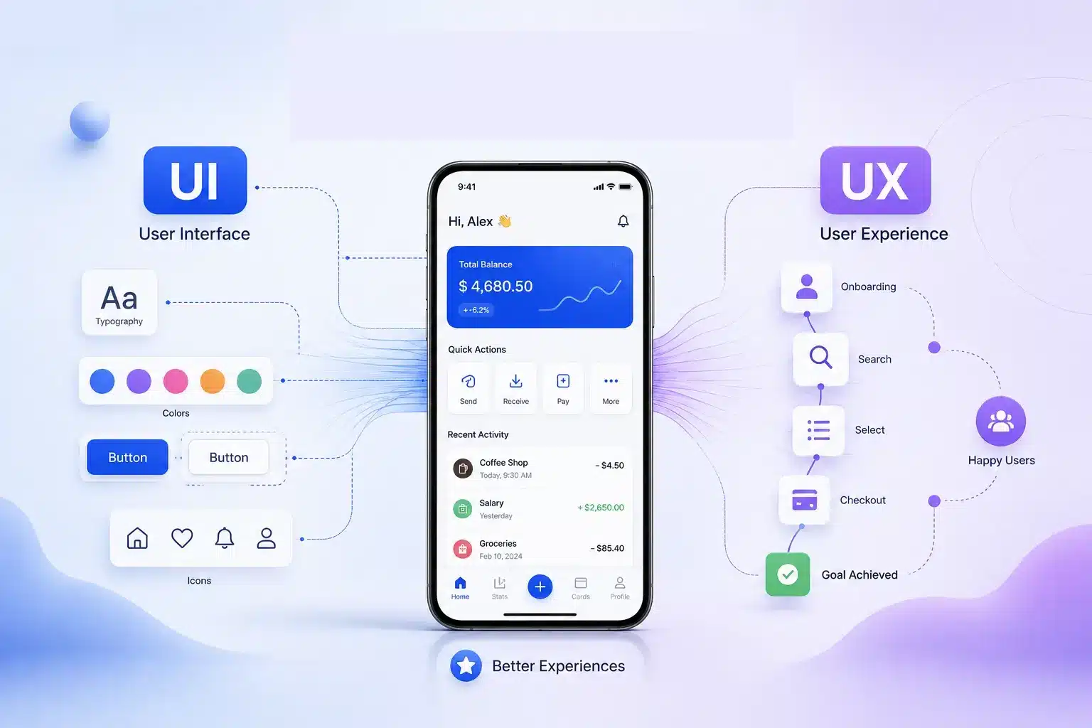
Key Takeaways
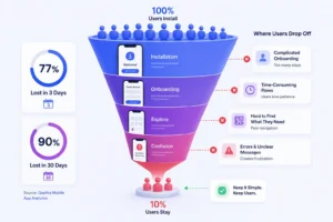
- Users leave quickly when UX creates friction. Research shows Android apps lose 77% of active users within 3 days and 90% within 30 days, making onboarding and usability critical.
- Strong UI alone does not improve retention. A visually polished app may attract users, but confusing flows and poor navigation often lead to drop-offs.
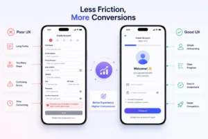
- Fewer steps lead to better conversions. Reducing taps in key actions like signup, checkout, or booking improves task completion and engagement.
- Early UX investment reduces costly rework. User research and usability testing help identify structural issues before they turn into expensive post-launch fixes.
- UI and UX perform best together. Apps that balance intuitive interfaces with seamless experiences are more likely to retain users, improve engagement, and earn positive reviews.
________________________________________________________________________________________
UI and UX are two of the most frequently misused terms in mobile app development. Product teams, founders, and business owners often treat them as synonyms or assume that investing in one automatically takes care of the other. That assumption leads to a specific and very common outcome: an app that looks well-designed but consistently underperforms on retention, task completion, and user satisfaction.
Understanding UI and UX is not a design theory exercise. It is a practical business decision that affects how your app is scoped, budgeted, built, and evaluated. This guide breaks down what UI and UX actually cover in the context of mobile apps, how they work together, what it takes to execute both well, and what the consequences are when either is neglected.
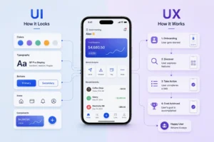
What are UI and UX? A Side-by-Side Overview
UI and UX are closely connected, but they influence different aspects of how users interact with a digital product. While UI focuses on the visual and interactive elements users engage with, UX centers on the overall journey, usability, and satisfaction.
To better understand how their responsibilities differ, take a look at the comparison below:
| Aspect | UI (User Interface) | UX (User Experience) |
| Focus | Visual interaction | Overall experience |
| Goal | Make the app visually intuitive | Make the app useful and frictionless |
| Concern | Buttons, typography, colors | Navigation, flow, usability |
| Deliverables | Screens, icons, design systems | User journeys, wireframes, testing |
| Success Metric | Visual consistency | Task completion, retention |
In simpler terms, UX defines what the user journey through your app should be, and UI shapes the visual environment users interact with along that journey. Both address real problems, and both require deliberate investment.
Why UI and UX Matter More in Mobile Apps Than on Websites
The importance of UI UX in mobile apps is higher than in websites because design constraints are tighter on mobile screens than on websites. Website users (with desktop users having a fair share of total users) typically have larger screens, a keyboard and mouse, and more patience for navigating complex interfaces.
While websites also need to be designed for a mobile-first policy, as highlighted by Google in one of their updates, a huge chunk of users still have the option of a wider screen to access the website, which is not the case with mobile apps.
Several factors make mobile app UI UX design uniquely demanding, such as:
- Limited screen space means every element on a screen is competing for attention. Unnecessary components do not just look cluttered; they actively obstruct the user.
- Thumb-driven navigation means that interactive elements placed outside natural thumb reach create physical friction with every use.
- Short user sessions mean that most mobile interactions are goal-oriented and time-pressured. Users open an app to do something specific, and if they cannot do it quickly, they simply leave.
- High uninstall rates reflect low tolerance for confusion. According to Quettra research, an Android app loses 77% of its daily active users (DAUs) within the first three days after installation, and 90% within the first 30 days.
- Micro-interactions such as button feedback, transition animations, and loading states have a measurable impact on how responsive and trustworthy an app feels to users.
Consider the following examples to make this concrete:
A fintech app may look modern and visually appealing, but users can still abandon it during signup if the onboarding process feels confusing. For example, asking for too much information, requiring users to repeat steps, or failing to explain how to upload documents clearly.
Similarly, an e-commerce app with strong product photography and a clean layout will still lose conversions at the checkout page if the payment flow is poorly structured.
Mobile App UI Design: Key Elements, Best Practices, and What Makes a Great Interface
Mobile app UI design covers every visual and interactive element that users see and engage with inside an app. A well-designed interface helps users quickly understand what actions are available, where to focus their attention, and how to move through the app without hesitation. In many ways, UI acts as the visual language of a product, guiding users through screens, reducing confusion, and shaping first impressions.
In mobile apps, where screen space is limited and user attention is short, thoughtful UI design becomes even more important. Elements such as typography, colors, spacing, and buttons are not independent design choices; they work together to create clarity, consistency, and usability.
Key Components of Mobile App UI
- Typography affects readability across different screen sizes, ambient lighting, and user demographics. Font choices and text sizing are functional decisions, not purely aesthetic ones.
- Color systems communicate brand identity, establish visual hierarchy, and carry accessibility implications. Poor contrast ratios directly affect usability for a significant portion of users.
- Button styles signal what actions are available and how important they are. Size, placement, label clarity, and contrast all influence whether users tap a button or miss it.
- Visual hierarchy organizes screen content so that users immediately understand what is most important and where to focus their attention.
- Iconography supports faster navigation when icons are universally recognizable or clearly labeled. Ambiguous icons increase cognitive load.
- Spacing and layout determine whether a screen feels organized or overwhelming. Adequate whitespace is a functional requirement, not decorative.
- Motion and animations provide feedback and context during transitions. They help users understand what just happened and what they can do next.
Signs of Good Mobile App UI
Practically, good UI shows up as:
- High-contrast CTAs that are easy to locate
- Text that is legible without zooming
- Consistent layout patterns across screens that help users build a reliable mental model of the app
- Color contrast that meets accessibility standards
“Users form impressions of digital products within milliseconds of first exposure. That initial judgment is based almost entirely on visual design. Banking apps, ride-booking apps, and ecommerce apps all rely on strong UI to establish credibility before the user takes any action.”
Don Norman, co-founder of Nielsen Norman Group and the person who coined the term “user experience.”
UI Best Practices for Mobile Apps
Getting UI right on mobile requires more than a good eye for design. The following practices consistently separate high-performing mobile interfaces from average ones:
- Design for thumbs first. The bottom two-thirds of a mobile screen is the natural thumb zone. Place primary actions and navigation elements within easy reach, and keep secondary or destructive actions (like delete) at a distance that prevents accidental taps.
- Maintain visual consistency across screens. Button styles, icon sizes, font hierarchy, and color usage should follow a defined system. Inconsistency forces users to relearn interactions on every new screen, which creates cognitive friction.
- Use contrast intentionally. Contrast is not just about accessibility compliance (though WCAG AA contrast ratios are the baseline). High contrast between text and background, and between primary and secondary actions, guides user attention and speeds up decision-making.
- Reduce visual noise. Mobile screens do not have the luxury of whitespace that desktop designs enjoy. Every visual element should earn its place. Cluttered screens increase the time it takes users to find what they need and reduce overall confidence in the app.
- Make interactive elements unmistakably tappable. Buttons should look like buttons. Links should look like links. When interactive and non-interactive elements are visually indistinct, users miss actions or tap on elements that do nothing, creating frustration.
Here’s a table to help you understand why these best practices matter for a rich mobile app experience:
| UI Best Practice | Why It Matters |
| Thumb-zone design | Reduces physical friction on every interaction |
| Visual consistency | Helps users build mental models faster |
| Intentional contrast | Guides attention and improves accessibility |
| Reduced visual noise | Speeds up task completion and reduces errors |
| Clear interactive affordances | Eliminates confusion about what is tappable |
Mobile App UX Design: Key Elements, Best Practices, and What Creates a Seamless User Experience
While UI focuses on how an app looks and feels, mobile app UX design focuses on how the app works for the user. It covers the complete experience of interacting with a product, from the moment someone downloads the app to how smoothly they complete actions over time. The goal of UX is not just usability, but reducing friction so users can accomplish tasks naturally, efficiently, and without confusion.
In mobile apps, UX becomes especially important because users expect instant clarity and convenience. Poor navigation, confusing onboarding, or too many steps can frustrate users quickly. Visual appeal alone cannot prevent users from abandoning an app if the experience feels complicated. Strong UX design helps users move seamlessly through an app, anticipate what happens next, and feel confident while interacting with different features.
Key Components of Mobile App UX
To create that experience, UX design focuses on several foundational areas that collectively shape how intuitive and user-friendly an app feels:
- User research to identify who the app serves, what they are trying to accomplish, and where existing solutions are falling short.
- Information architecture to organize features and content in a structure that aligns with how users think, not how the system is built on the backend.
- Navigation flow to ensure users can move between screens logically and without unnecessary steps.
- Task completion to confirm that users can accomplish their core goals efficiently and without encountering preventable errors.
- Onboarding experience to reduce the learning curve and help new users reach their first meaningful outcome as quickly as possible.
- Error prevention and recovery to guide users back on track when something goes wrong, with clear messaging that does not leave them stranded.
- Usability testing to validate design decisions with actual users before and after launch, and to identify friction points that internal teams often overlook.
Signs of Good Mobile App UX
The most reliable indicators of strong UX are behavioral, such as:
- Users complete checkout without abandoning mid-flow
- Support tickets related to navigation confusion decrease
- Day-30 retention improves
- Key task completion rates increase
Good UX tends to be invisible to the user because there is no friction to notice. Users simply accomplish what they came to do.
Note: Strong UX Is Defined by What Users Do Not Notice
When UX is working, users do not comment on how easy the app is to use. They simply complete their tasks and move on. Friction is what gets noticed. If users are describing navigation steps, commenting on how many taps something takes, or abandoning flows mid-way, UX is telling you something that analytics alone may not surface clearly enough.
UX Best Practices for Mobile Apps
Delivering strong UX on mobile requires a combination of research, structure, and ongoing validation. The following practices are foundational to a high-quality mobile app experience:
- Start with user research, not assumptions. The most costly UX mistakes are structural ones built on assumptions about what users want. Interviews, surveys, and competitive audits conducted before design begins surface needs and friction points that shape better information architecture and flow decisions.
- Design onboarding to reach the “aha moment” fast. The onboarding flow is where most app abandonment happens. The goal is not to explain the app. It is to get the user to their first meaningful outcome as quickly as possible. Every step that delays that outcome is a step that increases the likelihood of churn.
- Reduce steps in high-frequency tasks. Identify the two or three actions users perform most often and minimize the number of taps required to complete them. The faster users can accomplish their core tasks, the stronger the engagement loop becomes.
- Write error messages that guide, not blame. Error states are one of the most underinvested areas of UX. Clear, specific error messages that tell users exactly what went wrong and how to fix it reduce support volume and prevent flow abandonment. Vague messages like “Something went wrong” do neither.
- Test with real users before and after launch. Internal teams are too familiar with the product to reliably identify friction points. Usability testing with representative users before launch catches structural issues while they are still inexpensive to fix. Post-launch testing turns behavioral data into actionable design decisions.
Here’s how these UX best practices impacts businesses:
| UX Best Practice | Impact |
| Research-led design | Prevents costly structural redesigns post-launch |
| Fast-path onboarding | Reduces early churn and improves Day-1 retention |
| Minimized task steps | Increases frequency of use and engagement |
| Clear error messaging | Lowers support volume and prevents abandonment |
| Ongoing usability testing | Surfaces friction that analytics alone miss |
Real-World UI and UX in Mobile Apps: Category Examples
The following scenarios illustrate how UI and UX present as distinct but interconnected challenges across different app categories.
Example 1: Food Delivery App
- UI covers the visual presentation, such as food photography, color palette, card layout, and iconography.
- UX covers whether a user can find a nearby restaurant, customize an order, apply a promo code, and check out in a reasonable number of steps.
A food delivery app or restaurant online ordering platform can have well-designed menu cards and still underperform if the restaurant search is slow, the filter options are buried, or account creation is required before browsing.
Example 2: Banking App
- UI covers dashboard layout, typography, iconography, and visual hierarchy.
- UX covers how many steps it takes a user to complete a fund transfer, how clearly the app communicates transaction status, and whether authentication requirements are proportionate to the action being taken.
Many banking apps present a clean, trustworthy interface while burying the most frequently used features behind redundant confirmation steps.
Example 3: Fitness App
- UI covers visual motivation: photography, color energy, and animated progress indicators.
- UX covers how quickly a user can log a workout and whether the data is presented in a way that actually informs their decisions.
If logging a session takes more steps than necessary, a significant portion of users will stop doing it, regardless of how good the app looks.
The table below maps common UI and UX failures across app categories:
| App Scenario | UI Problem | UX Problem |
| Ecommerce | Low-visibility CTAs, inconsistent product cards | Too many checkout steps, no guest checkout option |
| Healthcare | Dense, information-heavy screens | Unclear appointment booking flow, no confirmation feedback |
| Banking | Illegible font sizes on the dashboard | Redundant steps in fund transfer, poor error messaging |
| Fitness | Low-contrast progress indicators | Slow workout logging, disorganized data structure |
Common Misconceptions About UI and UX
Many products struggle not because of development, but because UI and UX were not approached correctly. Before making decisions about where to invest in design effort, it is worth addressing a few common myths that often shape poor product choices.
Debunking Common Myths Related to UI UX
Myth 1: Good UI automatically means good UX. Visual polish and usability are independent variables. An app can score well on aesthetic quality and still fail basic usability benchmarks. These are different problems that require different types of expertise and processes.
Myth 2: UX is only relevant for large companies. Early-stage products are often the ones that need UX investment most, because structural problems in navigation and task flow become significantly more expensive to correct once development is complete. Skipping UX research early is one of the most common contributors to costly post-launch redesigns.
Myth 3: UX happens after development. UX research, information architecture, and wireframing need to precede UI design and development. When UX is treated as a post-development layer, the result is usually surface-level adjustments to a structurally flawed experience.
Myth 4: UI is cosmetic. Every UI decision, including color contrast, button size, spacing, and typography, has a direct effect on whether users can interact with the app accurately and efficiently. UI is a functional discipline with measurable usability outcomes.
| Myth | Reality |
| Good UI = good UX | They address different problems and require separate investment |
| UX is a luxury | Poor UX directly increases redesign costs and reduces retention |
| UX comes after development | UX must inform the design before development begins |
| UI is decoration | UI decisions affect usability, accessibility, and user trust |
How UI and UX Work Together: The Product Development Workflow
The distinction between UI and UX does not mean they operate as independent workstreams. In a well-run product development process, they inform each other at every stage.
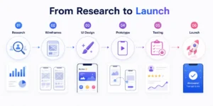
A typical workflow looks like this:
- User Research: UX designers identify user needs, map competitor gaps, and define the core jobs the app needs to do.
- Information Architecture: Content and features are organized into a structure that reflects how users think about the problem.
- Wireframes: Low-fidelity screens establish layout and flow without the distraction of visual styling.
- User Flows: Key task paths are mapped to confirm that users can complete core actions without unnecessary friction.
- UI Design: Visual designers apply color, typography, iconography, and motion to the wireframe foundations.
- Prototype: A clickable prototype simulates the real experience for testing purposes.
- Usability Testing: Real users interact with the prototype, and findings are fed back into design revisions.
- Iteration: The cycle continues post-launch, guided by analytics and user feedback.
UX defines what should happen within the app. UI defines how it looks and feels when it does. When these two disciplines operate collaboratively rather than sequentially, the outcome is an app where the experience is coherent at every level.
Key Insight: Sequential vs. Collaborative Design
Teams that treat UI and UX as sequential phases, i.e., finish UX, then hand off to UI, routinely encounter problems at the handoff point. Visual design applied to an unvalidated experience structure frequently exposes gaps that require going back to wireframes. Teams that run UI and UX collaboratively from the beginning reduce rework, shorten timelines, and produce more coherent products.
Can an App Have Great UI but Bad UX?
This question is worth addressing directly because it is more common than stakeholders expect, and it often goes undiagnosed because the visual quality of the app masks the underlying usability problems.
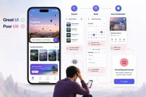
Consider a travel app with a strong visual design: high-quality destination photography, smooth transitions, and a clear visual hierarchy. If that same app:
- Requires account creation before allowing users to browse places,
- Puts the search bar below the fold, or
- Requires multiple taps to save a destination,
…then the UX is failing users, regardless of how good the interface looks. Users who cannot accomplish their goals within a reasonable number of steps will disengage.
The reverse is also true. An app with strong UX but weak UI may function well but fail to build the trust and engagement that comes from a polished, consistent visual experience.
Watch Out: Visual Quality Can Mask Usability Problems
A visually polished app creates strong first impressions, which can delay the recognition of underlying UX problems. Teams often interpret strong download numbers as validation of the product, only to discover retention and task completion issues weeks later. Tracking behavioral metrics alongside visual feedback gives a more accurate picture of how the app is actually performing.
What to Prioritize at Each Stage: A Practical UI/UX Roadmap
Neither discipline should be treated as optional, but the sequencing depends on the stage of the product.
For an early-stage product, UX should come first. Validating that the core flows work, that users can complete key tasks, and that the information architecture reflects how target users think will produce a more stable foundation than polished visuals built on an unvalidated experience structure.
For a mature product operating in a competitive market, stronger UI differentiation becomes a meaningful factor. When multiple apps offer comparable functionality at comparable price points, the product that communicates quality, trustworthiness, and clarity through its visual design will have a measurable advantage.
Instead of framing this as a binary choice between UI and UX, a more useful question for product and business decision-makers is: how can UI decisions actively support the UX goals we have already defined?
Here’s how UI and UX should be treated at each stage of the mobile app development lifecycle:
| Stage | Priority |
| Early-stage product | UX first: validate flows and core usability |
| Pre-launch | UI refinement applied to validated UX foundations |
| Mature competitive market | Both simultaneously, with UI reinforcing the experience |
| Post-launch optimization | UX improvements guided by retention and behavioral data |
The two disciplines produce the best outcomes when they are resourced and scheduled as complementary workstreams, not as sequential phases.
Wrapping Up
UI covers the visual and interactive layer of the app. UX covers the complete experience of using it. A product that invests in only one of these will have a defined ceiling on how well it can perform with users.
An app with strong UX but weak UI may function well but fail to build the trust and engagement that comes from a polished, consistent visual experience. An app with strong UI but weak UX may generate downloads and positive first impressions while consistently losing users at the points in the experience where they need the most clarity.
The apps that retain users, generate positive reviews, and build long-term engagement are the ones where UI and UX have been developed together.
For teams looking to improve user retention, usability, or digital engagement, working with experienced UI/UX specialists can help translate these principles into measurable outcomes. At Simpalm, product teams design intuitive mobile apps, websites, and PWAs through user-centered design, interaction design, usability testing, and scalable design systems. In one recent project, improvements to the product experience helped a gaming cafe rewards platform increase customer spending by nearly 25% and repeat visits by around 30%.
Frequently Asked Questions
Q1. What is mobile app UI design?
Ans. UI design refers to the visual and interactive elements users see and engage with inside an app. Key elements are buttons, colors, typography, layout, and icons. In mobile apps, UI also encompasses micro-interactions, motion design, and the visual hierarchy that guides users through screens. It shapes the first impression users form of a product and influences how trustworthy and intuitive the app feels.
Q2. What is mobile app UX design?
Ans. UX design covers the complete experience of using an app, from initial onboarding through recurring use. It includes user research, information architecture, navigation flow, task design, error handling, and usability testing. UX defines how efficiently and naturally users can accomplish their goals within the product.
Q3. Which is more important in mobile app design: UI or UX?
Ans. Both are necessary, but they serve different functions and require different processes. UX should generally be established first to ensure the app is structurally sound and usable. UI then makes that experience visually credible and engaging. Treating one as a substitute for the other produces a product with a predictable category of failure.
Q4. Can an app have good UI but bad UX?
Ans. Yes. An app can be visually well-executed and still be confusing to navigate, require too many steps to complete common tasks, or obscure key features. Visual quality and usability address different dimensions of the product and do not automatically compensate for each other.
Q5. Is UX part of UI or vice versa?
Ans. Neither is a subset of the other. They are complementary disciplines that address different aspects of the product. UX defines what the product should do and how users should move through it. UI determines how that experience looks and feels at the visual and interactive level.
Q6. Why do mobile apps fail because of poor UX?
Ans. Mobile users have limited patience for interfaces that require effort to understand. When an app is difficult to navigate, requires too many steps for common tasks, or provides unclear feedback after user actions, users will disengage. Poor UX contributes directly to low retention rates, negative app store reviews, and high uninstall rates.
Q7. When should a business invest in UI improvements vs. UX improvements?
Ans. The answer depends on where the product is underperforming. If users are dropping off during flows, failing to complete key tasks, or expressing confusion about navigation, UX improvements are the priority. If the product is functionally sound but struggling with trust, engagement, or differentiation in a competitive market, UI investment will have a greater impact. For most products, both are needed simultaneously, with sequencing determined by what is causing the most friction.


